


Strategic Problem
SACI required a contemporary digital presence that could effectively differentiate its diverse paramedical and hospitality programs while serving as a primary information hub for a growing student body. The challenge was to create a high-density information system that remained intuitive for users and easily maintainable for a non-technical administrative team.
Systemic Solution
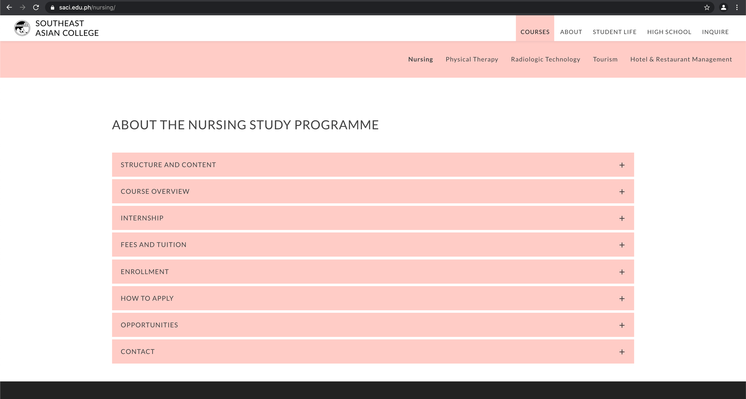
I architected a multi-tiered navigational framework utilizing a color-coded pathway logic to categorize distinct academic fields. I developed a custom library of responsive templates that allow the school to update news, events, and course details autonomously, ensuring the platform remains a living institutional asset.
Methodology
As the lead strategist, I mapped the student enrollment journey to define the core user flow, ensuring prospective applicants could move from program discovery to course details with minimal friction. I utilized iterative Figma prototyping to refine the content hierarchy, specifically focusing on the transparency of course descriptions and the integration of social proof through graduate testimonials.
Design Strategy
I implemented a dual-palette visual system: a primary institutional blue for core site navigation and secondary pastel accents to visually separate academic departments. This semantic use of color allows for rapid scanning, helping visitors instinctively understand which department’s content they are viewing as they navigate the menu and course toggles.
Client Collaboration
Acting as the lead design consultant, I partnered with SACI leadership to translate their institutional requirements into a streamlined digital experience. I balanced the need for academic authority with modern accessibility, ensuring the final interface appealed to both prospective students and administrative stakeholders.
Operational Design
I engineered the site's infrastructure to be modular, providing the school with the tools to manage high-frequency updates for news and future events without breaking the visual system. By standardizing the layouts for testimonials and event displays, I ensured that new content would always fit within the established high-fidelity framework.
Reflection
This project reinforced that academic UX must be built on information clarity. I learned that for large institutions, the most valuable deliverable isn't just a beautiful interface—it's a robust, user-friendly infrastructure that empowers the client to own their own digital story.
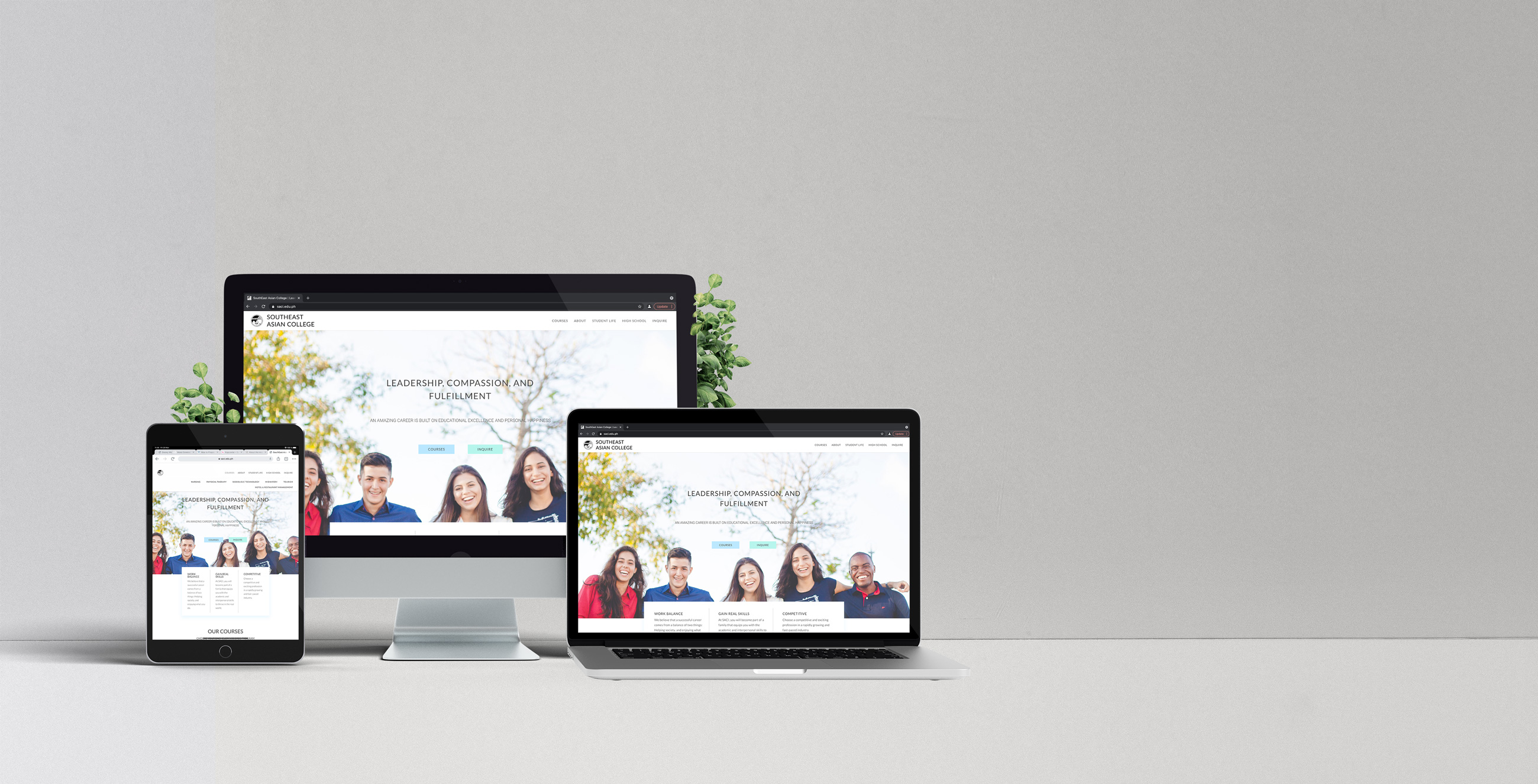
Website Overview
