Work/UX/UI/№01
UX/UI
Grundfos
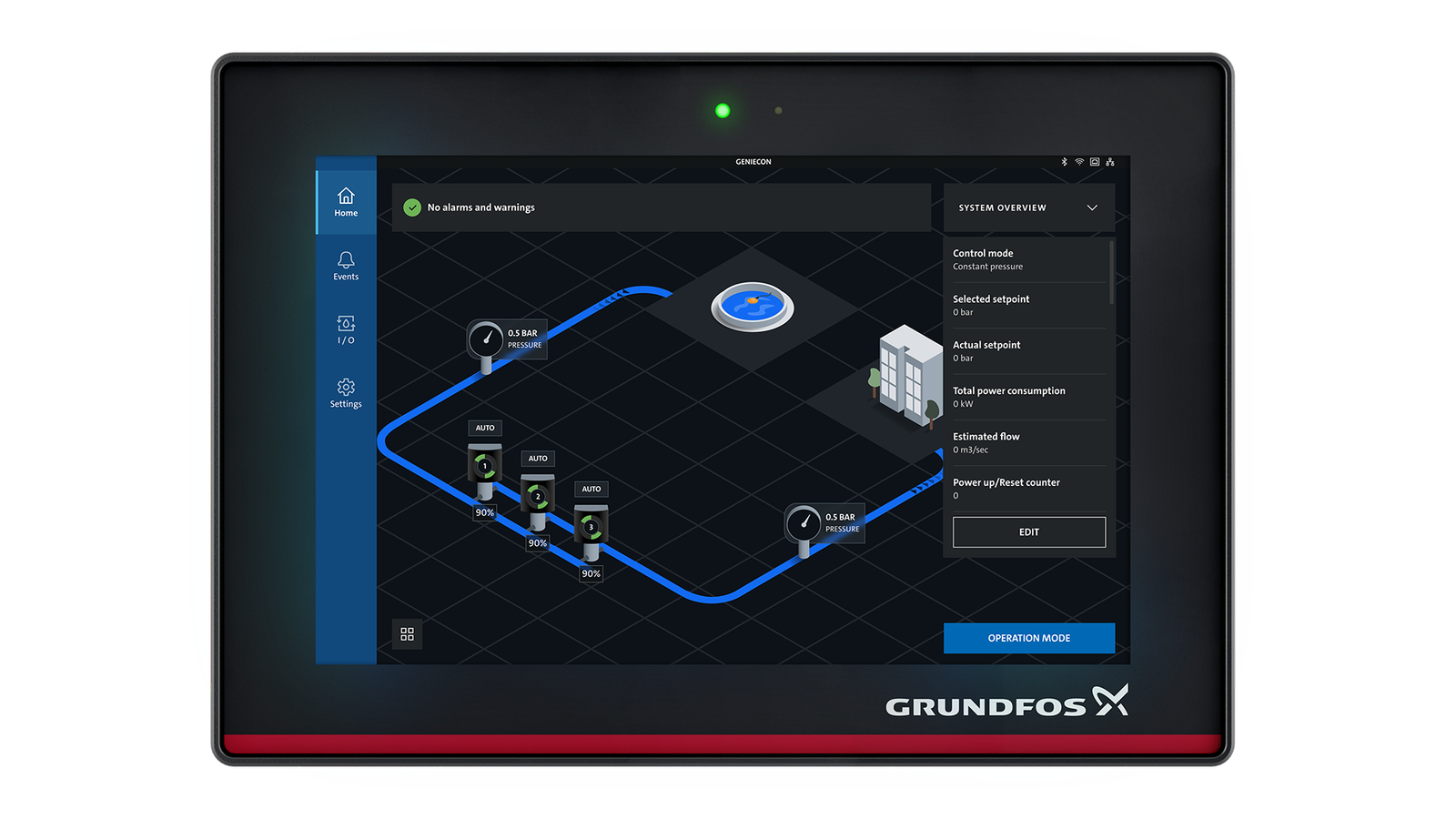
Isometric home screen for HVAC & Booster systems
Turned a chaotic, high-density industrial sensor and pump data into a clean, actionable monitoring interface for complex pump systems.
- Role
- Lead UX Architect
- Year
- 2024 – 2026
- Team
- Product specialists · Technical architects · Hardware engineers ·
- Stack
- Figma · IoT telemetry · Jira
Problem
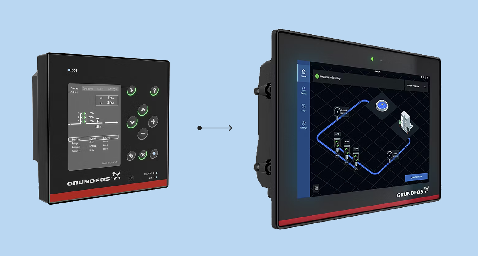
Industrial operators were forced to hunt through multiple fragmented menu stuructures to monitor complex HVAC and Booster performance. Because the original controller had a small screen with physical buttons, critical system features were frequently buried deep inside disparate sub-menus. This fragmentation created a high cognitive load for engineers and slowed down incident response times.
Approach
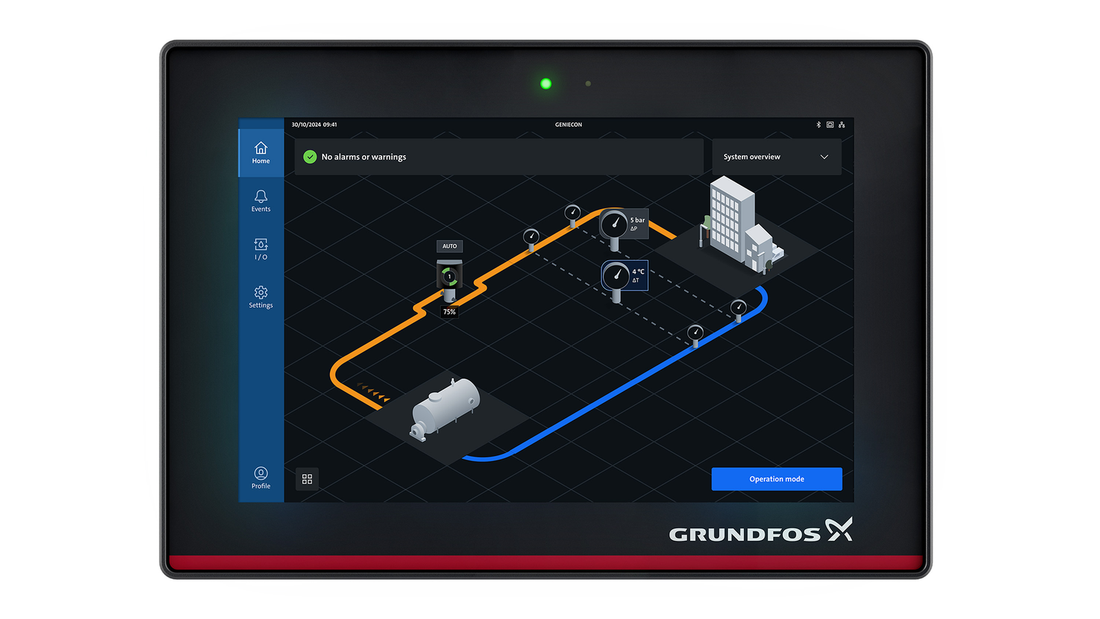
The strategy focused on creating an isometric home screen and dashboard for compex multi-pump systems. The core of the solution involved designing detailed data visualization and a glanceable interface. Pressure, flow rates, energy consumption remained readable, organized, and immediately actionable for engineers under operational pressure.
01
Component interaction framework
I transformed static isometric layouts into a functional interface with micro-indicators for high-level telemetry, expandable pump and sensor cards for deep-dive measurements, and explicit focus menu rules for opening, expanding, collapsing, and shuffling cards under diagnostic stress.
02
Closed-loop HVAC architecture
I pivoted from a nested sub-section model to a linear flow language (source → supply → pumps → sensors → consumer → return) shared with the Booster system. Created systemic UI rules to prevent infinite sensor clutter while preserving visibility for primary/redundant sensor pairs.
03
Unified telemetry matrix
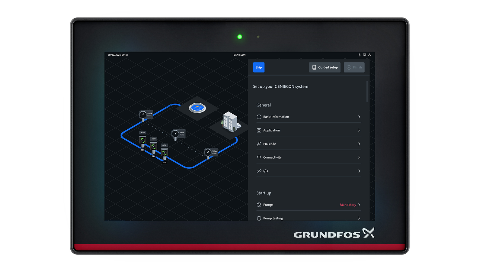
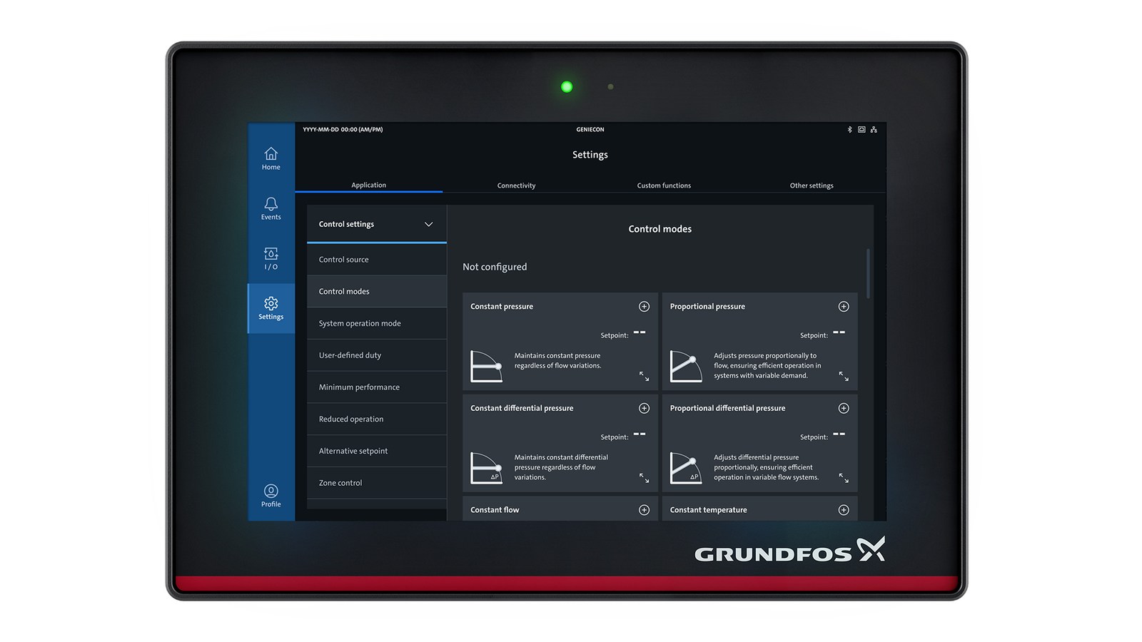
I built a dedicated system overview matrix that exposes both analog and digital sensors in one tabular view, giving engineers full diagnostic access without cluttering the active home screen.
04
Cross-functional specification
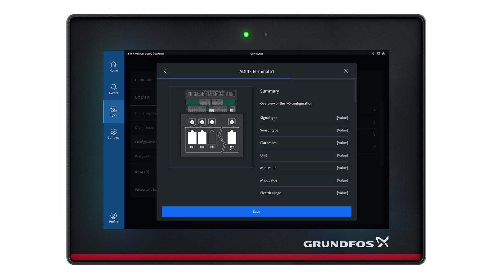
I aligned business development, product specialists, and software engineers through logic matrixes that defined operational necessities versus technical possibilities, flowcharts that documented user journeys and system interactions as a clear technical blueprint.
Process
Artifacts from the room.
Outcome
The consolidated home screen created a unique experience never used in the industry before with a large 13" touch screen where all information and features are at the fingertip of the user.
Automating the visual prioritization of system data ensured that critical faults are visible at the top of the interface instantly, lowering remediation times and preventing critical failures across global HVAC installations.
The final interface scored 78 on the System Usability Scale (SUS) and received direct validation from professional operators for its clarity and data-handling efficiency.
The modular UI framework standardized navigation and data hierarchies across the entire suite, allowing Grundfos to integrate new hardware components and pump types horizontally without requiring a system redesign.
Unified
One consolidated home screen replacing fragmented legacy portals
Safer
Critical faults bubble to the top, lowering remediation times
78
High SUS score and positive operator feedback on clarity
Scalable
Modular framework supports new hardware without redesign
Next