Work/UX/UI/№04
UX/UI
TheGuarantors
Enterprise design system
I built the company’s first comprehensive Figma design system to remove visual misalignment and restore brand credibility.
- Role
- Senior UX Designer & Design System Architect
- Year
- 2021
- Team
- Design · Engineering · Product
- Stack
- Figma · Material Design · WCAG 2.1
Problem
When an insurance platform looks inconsistent, users get nervous. Three core products lacked a unified UI direction, designers were working in silos, and the resulting visual misalignment was so severe that customer reviews raised scam concerns.
We did not just need a cleanup; we needed a bulletproof visual language that could win back user confidence and scale across every product.
Approach
I engineered a bespoke Figma design system from scratch, making it the single source of truth for all digital touch points.
01
Bespoke Figma architecture
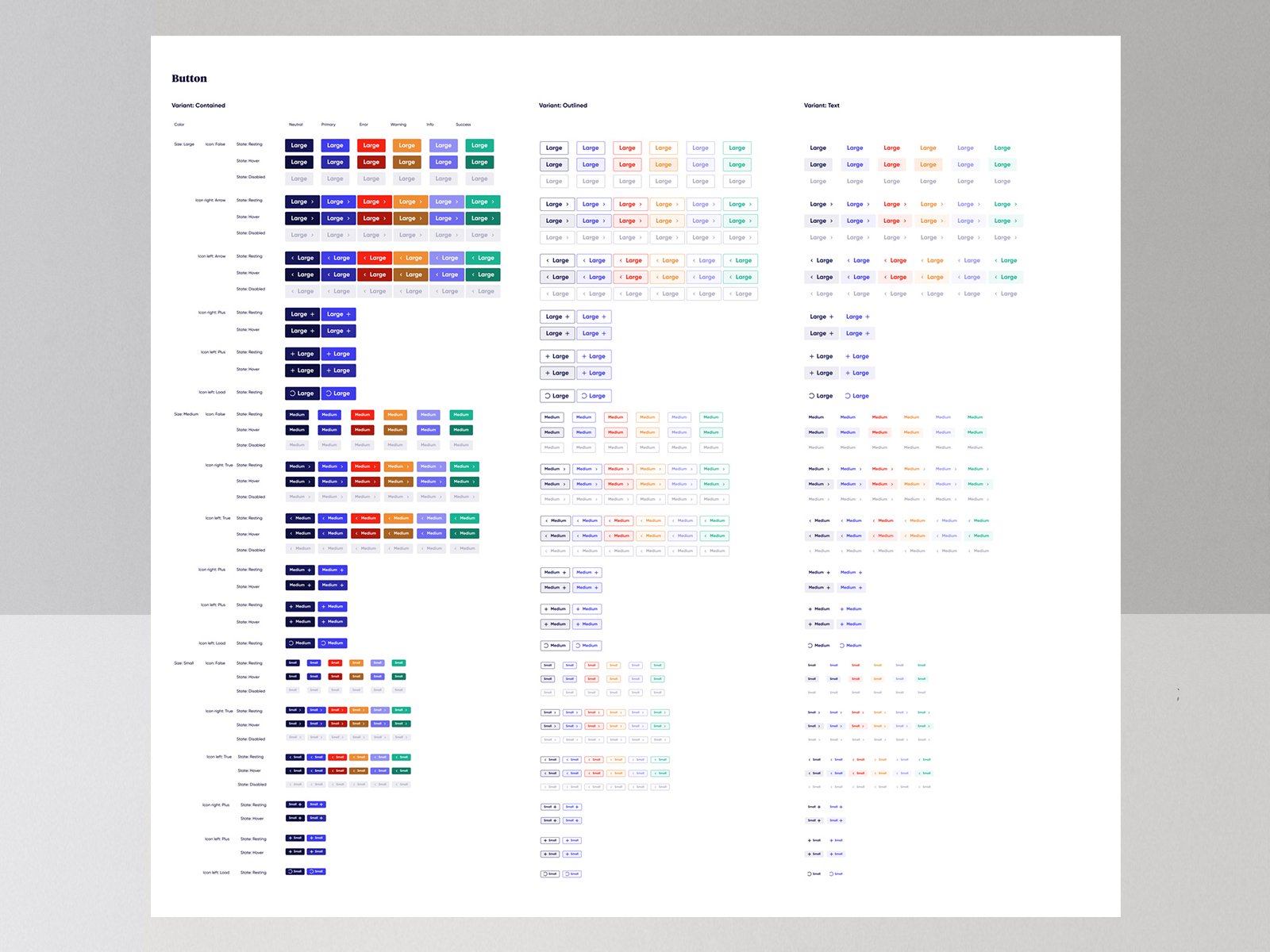
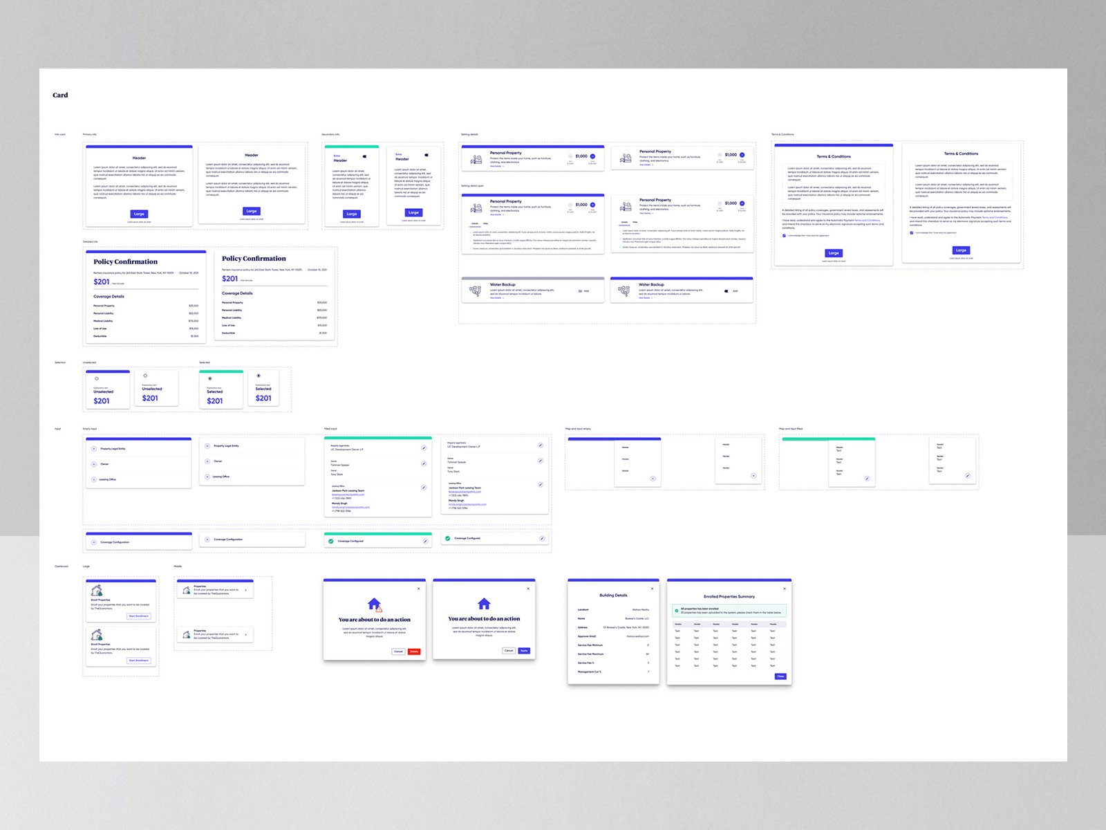
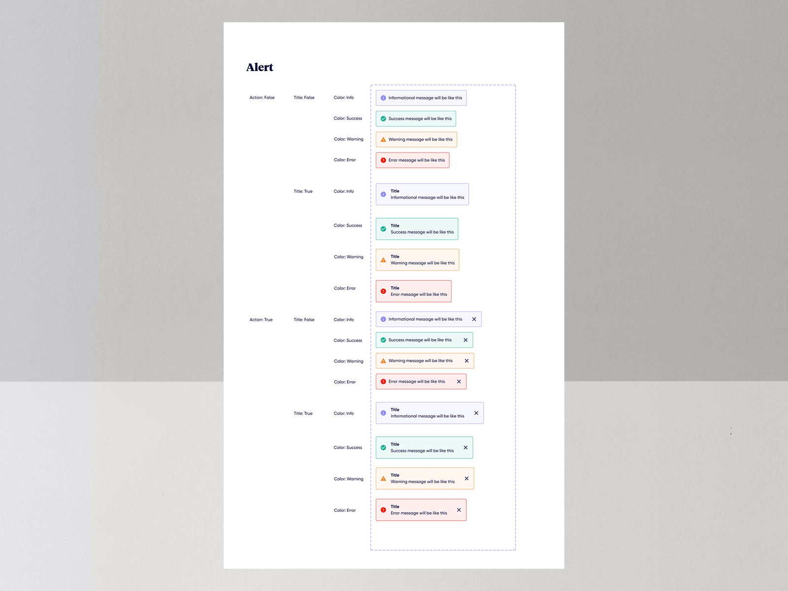
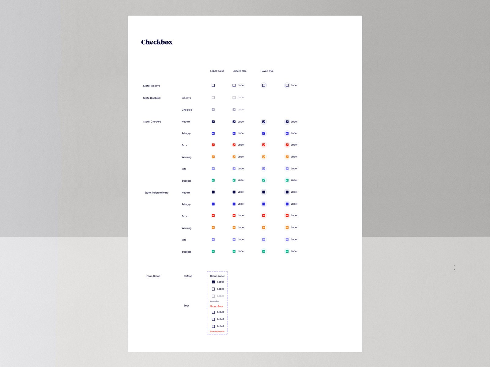
Instead of a generic kit, I built a custom library of components — including complex interactive states and accessibility-compliant forms — aligned to our technical constraints and Material Design migration.
02
Scalable typographic system
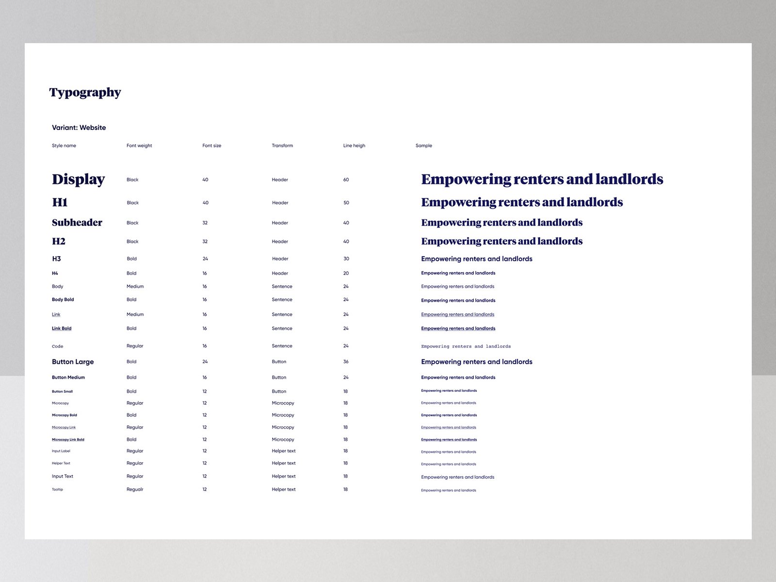
I centralized typography with strict rules for headings, body copy, and micro-copy, documenting line-heights and responsive behaviors so developers could build complex layouts with precision.
03
Accessible visual hierarchy
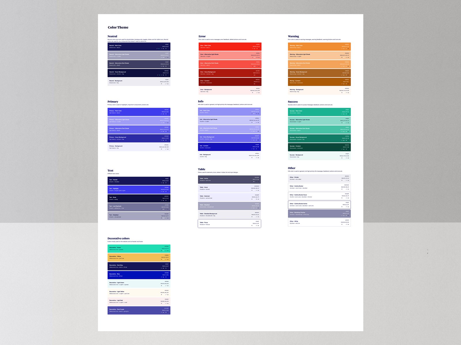
I expanded the color palette to support interaction states — hover, active, disabled — while keeping brand identity intact, stress-testing every element to meet WCAG 2.1 readability standards.
04
Deep prototyping logic
Building from scratch let me leverage Figma’s advanced prototyping so component behaviors in design mirrored exactly how they should function in code.
05
Collaborative contribution model
I established regular review cycles where designers and developers could refine component behaviors together, and documented usage guidelines so the system became a shared company asset.
Process
Artifacts from the room.
Outcome
The project restored brand credibility by fixing inconsistent experiences that were actively damaging user trust. It also established a highly efficient design-to-development pipeline that reduced handoff friction .
By turning the design system into a shared asset, the team gained a scalable foundation for future products without sacrificing consistency.
Building from scratch reinforced a core lesson that long-term consistency is not just about beautiful UI components. It also needs meticulous documentation.
1
Single source of truth for all digital touchpoints
3
Core products unified under one design system
WCAG 2.1
Accessibility standard met across components
From scratch
Bespoke Figma library built to exact technical constraints
Next